As readers of this blog you should all know by now that London’s
b store has long been a mecca for contemporary design. Whilst nurturing some of the best menswear design talent in the capital and beyond,
b store have been merging art, fashion and design seamlessly for a number of years now. With each visit to the Savile Row institution, there is the chance to discover a new designer, an exhibition, a magazine or even just a moment when you talk to them and leave with something new. You can always expect to be surprised when you visit the store. Though undeniably a stylish haunt, it has always been more than just a physical space and has certainly offered more than mere fashion. It was therefore, a natural evolution of the brand to venture in to print and thankfully
b magazine reflects the energy of the brand beautifully. We have been fans the moment our eager hands grasped the first issue back in September 2009. Created by b clothing’s Creative Director Jason Hughes and Editor Dal Chodha, the magazine exposes the wider b Store ethos; passion in design and integrity in individuality with a knowing nod to more sartorial affairs.
It sells ideas and it sells information. Editorially driven,
b magazine looks at creatives from a wonderfully unique angle. The world it weaves through and explores means that this is a publication that is nigh on impossible to put down. It concerns itself with what they are reading, rather than what they are wearing and worries more about familiarity than fantasy. To mark the imminent release of the issue three (Monday 8th November) which includes insightful pieces on BLESS and
Stephan Schneider, we caught up with both of its creators to discuss the issue over a cup of coffee and a cinnamon bun. What follows is our meandering conversation and a sneak peek inside the issue...

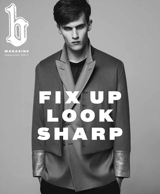
The cover of issue three.
SS: The magazine feels like a natural evolution of the b brand on to printed paper as it exposes the wider b-Store ethos. What were your inspirations, your dreams and the driving catalyst behind b magazine?
Jason Hughes: I've been working with both Matthew (Murphy) and Kirk (Beattie) from the very first collection and even before that point I worked with
Carola Euler who was stocked at the store, so I've known the store and the guys for some time now. We had a very casual conversation about the magazine with them, Dal and myself were clear that there were certain things that we wanted to do and certain things that we didn't want to do. Primarily, we did not want it to be another fashion title because we both felt that there already were enough titles out there, some of which were doing it very well, some doing it not so well. It was very important to us that we were crating a magazine that came from an alternative point of view to anything already out there. We talked to Matt and Kirk about the store; the designers they stocked, the people who shop there or those involved in the store in some way, be that artists who have shown in store or creatives who they have collaborated with in some way and at this point we realised that this was more than a lifestyle. We described it as a world, the bstore world. This notion was of the main catalysts for the magazine. We were excited by how vibrant the b world was, not just in terms of the label or the clothes but the people which inhabited it. More than that though, this pool was a massive source of content for us.
SS: By the very nature of the store, the magazine is much more than an in store publication...
Dal Chodha: In a way it felt like an untapped pool of content. Such amazing people that come in either to shop or interact with it in some capacity.
Jason Hughes: Hopefully the magazine reflects the energy of the store. You can always expect to be surprised when you visit the store, there is going to a new designers, exhibition, magazine in the book corner or even just a moment when you talk to them. The store has always been about the new and I've always admired it for that. Matt and Kirk have always put themselves out there to discover a new designer and to support them, some of whom they have continued to support and some might have fallen off but they've always had a strong relationship with them and grown with them. I've always admired their ability to discover and nurture and this certainly fed in to the publication. At no point did we want this to be an in store magazine but rather, we have always wanted to create a lifestyle publication. Welcome to our world, it is an exciting place.
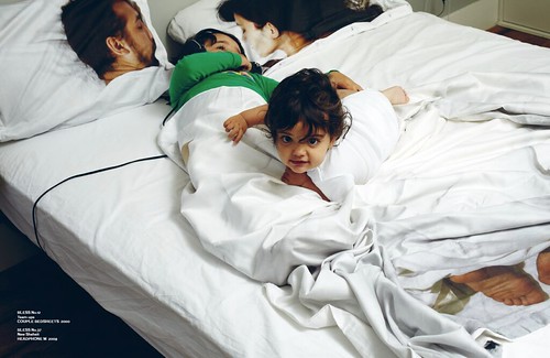
Unclassified. Welcome to the world of BLESS. Words by Ben Purdue, photography by Franck Sauvaire with Jane Howard as fashion editor.
SS: What was the starting point for the third issue? How did it evolve?
Dal Chodha: It is important for us to offer something that our readers cannot get anywhere else. The research aspect for each issue is the hardest part because we discuss topics that you can only know if you have a personal relationship with the people involved. For example, with regard to the collectors feature in this issue there is no way that your average pr would have that type of information. There is a natural progression from the last issue. We discussed the last issue and ideas on where we would like to take it, areas that we'd like to explore and expand on and this is particularly true within the articles.
Jason Hughes: We tend to have a lot of ideas and there is only a certain you can actually cover in one issue without it becoming repetitive.
Dal Chodha: We are friends as well, so outside of the magazine we share a great deal. We both have folders on our desktops as all of us do of ideas that have captured our imagination so when we meet we both discuss what we have found. For me, my main focus in the features is to talk about people that haven't been exposed in the way they deserve.
B for Baracuta. The SS11 collaboration is previewed. Words by Dal Chodha, Photography by Laurence Ellis with Jason Hughes as Fashion Editor.
SS: I have really enjoyed the recent designer features, Chrishophe Lemaire in the last issue and now Stephan Schneider. These are names people might be familiar with but your features bring them to life. I have to confess that I knew very little about Christophe before his stunning AW09 collection, that collection really made me take notice of his work. So your feature was extremely well timed...
Dal Chodha: Exactly, we've taken this ethos from bstore really. To highlight brands that people in the know, know about but our job is to promote them in a way that is fitting of their talents. We want to take them and elevate them as much as we can. Christophe's work for example is amazing but not enough people know about him or his work.
Stephan Schneider. In conversation with. Words by Dal Chodha and photography by Stefan Heinrichs.
SS: I found it interesting to observe the knock on effect of your feature on Christophe Lemaire. Quite a few publications and websites featured him following your issue launch. He was now on the radar, of course his appointment of Hermes magnified this even further...
Jason Hughes: The Hermes appointment was amazing timing really. We knew nothing about it at the time, neither did Matt.
Dal: It was announced three weeks after I met him in Paris. Of course he would have known but it wasn't mentioned during the course of our discussion.
Jason Hughes: It was really interesting when Tim featured him on style.com and did a review of the show. I think that was partly because of the last issue as well. For us, it felt like the right time to introduce him to a wider circle.
Dal: Both Christophe and Stephan have been in the industry for many, many years and that for us, is an important aspect of fashion. It is, after all a business as well as being inspirational. These guys have built solid foundations for selling clothes.
Jason Hughes: The designers that we feature and shoot are ones that tend not to tackle ephemeral trends and both Christophe and Stephan have certainly shied away from this aspect of fashion. They are much more interested in creating a highly distinct style and in cultivating collection upon collection.
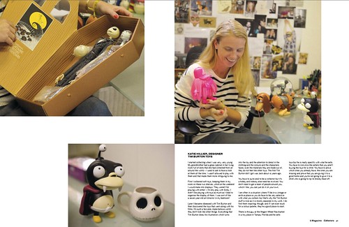
The Collectors. b meets four collectors and discovers the UK's largest collection of vintage Hawaiian ukuleles along the way. Words by Dal Chodha and photography by Clare Shilland.
SS: Within the issue you introduce four collectors and their carefully curated obsessions, including Fraser Moss' vinyl and Katie Hillier's Tim Burton toys. Are either of you collectors?
Jason Hughes: Only obvious things but nothing that specific.
Dal Chodha: Me neither but I think that is what attracted us to this feature even more. It really was a nightmare to research because people kept coming back with "I collect magazines and these inspire my collection' but we wanted to go deeper and unearth a selection of unusual collections.
Jason Hughes: I've always been interested in people that have obsessions. The feature actually began when we had a discussion about fans, from fans of bands to Japanese girls who hoard Chanel bags, this then evolved in to people who obsessively collect things. it is amazing to love something so much. I think Katie's obsession with Tim Burton toys is the most fascinating, she even talks about how the toys inspire her and when she is stuck for a colour palette she goes to her toys, for me that is just genius.
Dal Chodha: These types of features are always so intimate and enjoyable to work on. Clare (Shilland) and I went to each of their houses and you can't help but become enamored with their collections. These people tend not to be asked about these passions.
Jason Hughes: I've always liked the feeling of when you think you know somebody but then discover what is behind that. It is always very interesting, what is behind this hardcore fashion person.
Furniture. Meet the future of furniture design. Words by Lewis Chong and photography by Retts Wood.
SS: Looking back over the issue now, is the collectors feature your highlight?
Jason Hughes: Actually, I really enjoyed the furniture article. For both of us it is a real highlight of the issue and it was borne out of a conversation with Matt, both of us are interested in furniture design, and we began this quest to find the new furniture designers. It was a lengthy process that went on for months but we are so pleased with the results.

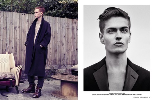
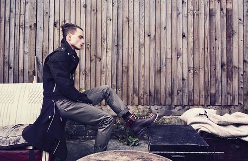
In A Lonely Place. Photography by Nicholai Fischer with Jason Hughes as Fashion Editor. SS: Despite my obvious love of digital media, I have enjoyed a love affair with printed fashion journalism for many years. What were the magazines that you just had to buy each month, quarterly or biannually? Are there any today that still excite and inspire you?
Jason Hughes: Funnily enough, if I were to be obsessive about anything it would be with magazines. I grew up in the 90s idolising magazines like iD and The Face. I'm from a small village in Wales and these magazines acted as escapism but they also informed me and opened my eyes to lots of things. Some of that has had a lasting legacy on me. There was a point in time when they were barometeres of style but times have changed. Now, I like lots of smaller, independent magazines, similar to those that Matt likes actually. The ones that have a distinct personality and are quite niche, obsessive about their subject matter. Aparamento is a great example, so inspiring. The layout is interesting, the people thy feature and their whole perspective of the home is very interesting. It is an antidote to Homes & Garden. I also love
032c, it is one of the only magazines that has been able to successfully merge disciplines of art, design and fashion.
Dal Chodha: I have quite a romantic vision of magazines. I like having to sit and stop and taking time out and magazines should slow people down. I'm not particularly loyal to any title.
Jason Hughes: It is important for me that there is something to read in the magazine, it isn't just a . There should be well written features that are informative and exciting to read. There has to be a balance.
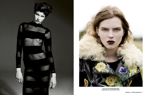
All Those Yester Days. Photography by Willem Jaspert and Sam Ranger as Fashion Editor.
SS: There is certainly that balance in b. How do you see the publication developing in the issues ahead?
Dal Chodha: Thank you. We are really pleased with the balance and we will continue along the same path in future issues. We always have so many feature ideas but for us it important not to overload the reader with information. A magazine should be able to be consumed relatively easily, we just want to create something that can be enjoyed and kept for reference.

In A Lonely Place. Photography by Nicholai Fischer with Jason Hughes as Fashion Editor. .
_____________
In the tricky world of magazine publishing,
b Magazine offers a welcome antidote to the over saturation of information on the market, which has led to a dilution of intelligent and informed journalism. It challenges the way we consume, interspersing inspired wisdom with intuitive photography within the traditional format of a fashion and lifestyle title. I'm without doubt that your coffee table or book shelf will be a better place with the addition of this publication so please do pick up a copy next week.





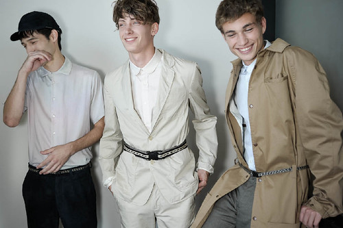
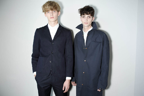
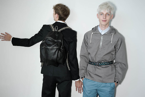

 The front page of Binary.
 What's to become of the magazine?
 The Kim Jones interview is a great read
 Katie Grand talks technology
 The Tim Blanks interview is wonderfully odd.
 One of the three editorials, City Shorts.
 One of the three editorials, City Shorts.
 One of the three editorials, City Shorts.
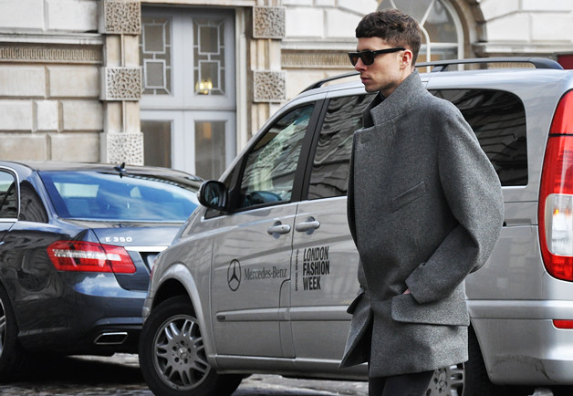 "The volume of this structured coat immediately caught my eye, especially the spiraled effect on the sleeve." Tommy shooting LFW for GQ.
 "It's refreshing to see a gentleman who still takes the time to really be well-dressed. From the colors to the contrast of the patterns, you'd think you'd have to go to Europe to see men's style like this." Tommy shooting NYFW for GQ
 "Let's take a closer peek at his accessories, starting with the navy monogrammed satchel. Seriously, I don't think you have to be a student to carry this off? Or do you?" Tommy shooting LFW for GQ
 "I just adored how Dazed & Confused Menswar Fashion Editor, Robbie Spencer, wore his Lanvin beaded Trope L'Oeil t shirt. Rather than wearing the look directly from the runway, he layers it with an effortless ease. Bravo." Shot for Jak & Jil.


 Long may Tommy Ton capture the beauty of the detail in menswear. It is after all, the small details, so often overlooked and neglected by too many, that can transform any mediocre outfit in to something special.


 With each season, the design duo begin with the desire to capture, play and experiment with the duality of English Sartorialism and British Anarchy. In creating a new collection their driving motivation is to capture the feelings of an ever-changing environment and to communicate society's natural inclination to move forward. The clothes start from a traditional stand point, but rather than being nostalgic and whimsical, we choose to reflect the spirit of 21st century gentleman - a character conscious of many reference points yet someone who chooses to distill his style into a concise statement. Things have moved on since the days of the Duke of Windsor, and although he is a great inspiration and a foundation for the brand, the modern sartorialist has a different appetite. Their requirements, desires, and practical needs are frequently drawn towards a synergy between the formal and athletic. For this collection, the duo include the requirement and need of protection. This sartorial cocktail is seen runs throughout the outerwear, tailoring and accessories. There is always a narrative at the core of what they do, connecting each collection to the last and making foundations for the next. For this season the pair examined the recession and discussed how people subconsciously react to it on an aesthetic level.
 "AW10 started out as a discussion between the two of us about the recession and how people subconsciously react to it on an aesthetic level. The importance of body armour as a form of protection stimulated ideas about re-interpreting outerwear. Black felt like a natural principle colour to express what we wanted to communicate, and this was how we came to combine military clothing with evening wear as one of our lead looks."


 Alongside their ongoing interest in light weight fabrics, a new ’Body Armour’ aspect is introduced to outerwear. The Riot shield jacket Parkholme features a protective quilted detachable front panel. Ashwin, the Storm Biker’s Coat is made from 1000 grams Melton, giving it an authentic and practical Military handle. This season the concept of evolving jackets into shirts moves forward, with a new interpretation of the popular Trench Shirt, and the waxed functional English Field jacket also takes on shirt proportions. Their formal wear proposal continues its casual theme with a beautifully realised Shirt Dinner Jacket, which embodies the brand duality of English sartorialism and British anarchy.
 The light graphic ‘Equestrian’ jersey print which adorns the Jackson trousers, New Moon slouchy jacket, and Beechwood sweat top, stands in stark contrast to the gravitas of the powerful Midnight Blue and varying shades of Black. Here boundaries of masculinity are challenged with the decorative print and sequined Colebrook knit jacket, set against hardware black boots by Casely- Hayford for John Moore. Casely-Hayford’s quintessential slouchy jersey suit re-emerges with a looser form and more fluid silhouette. The tailoring once again fits perfectly with my current sartorial aesthetic. The collection begins to touch on an aesthetic shift from one decade to the next, harnessing ideas of Futurism and Minimalism, experienced through sleek lines and muted block colours.
 The collection builds on the sportswear and tailoring mix by adding military influences both in terms of the battle friendly palette and the armour like finishing details. Quite simply this is the collection that Casely-Hayford have wanted to make since launching the label and this is the collection we all wanted. It will be available at the recently opened menswear store on Redchurch Street Hostem and the ever amazing Dover Street Market. If you want to read my interview with Charlie in its entirety please do head over to Dazed Digital.

